 EV Light
1 / 5
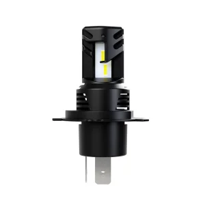
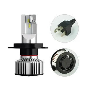
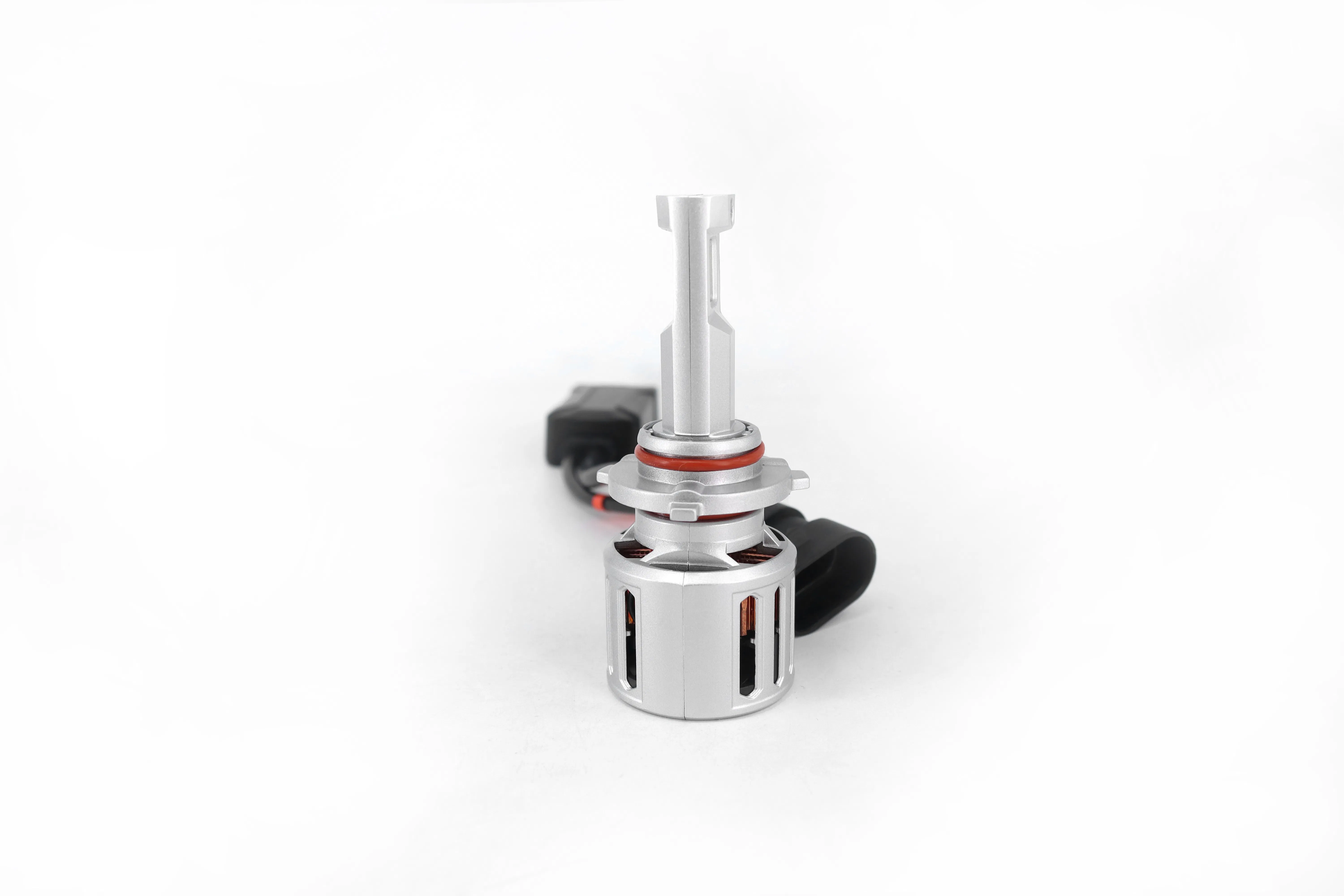
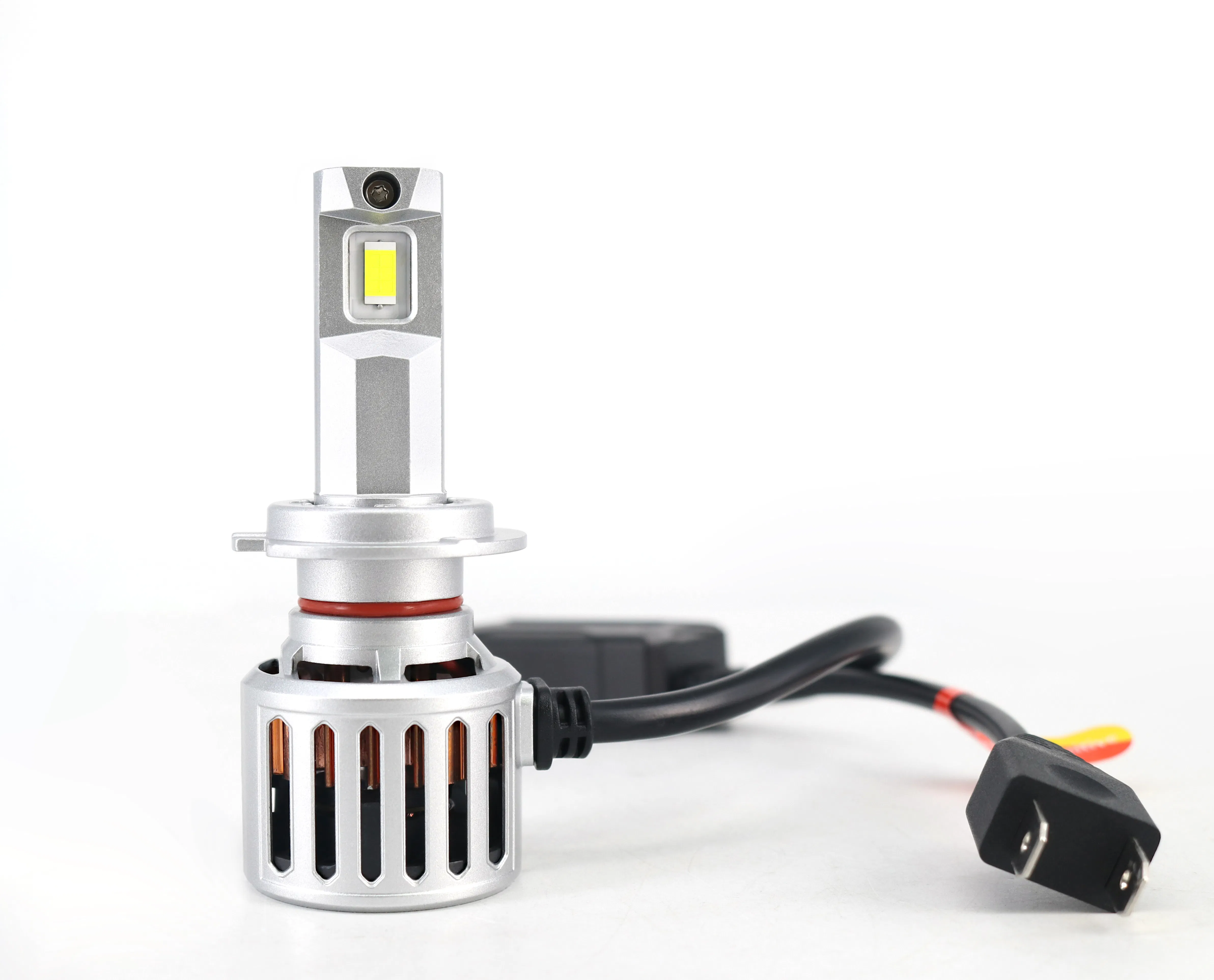
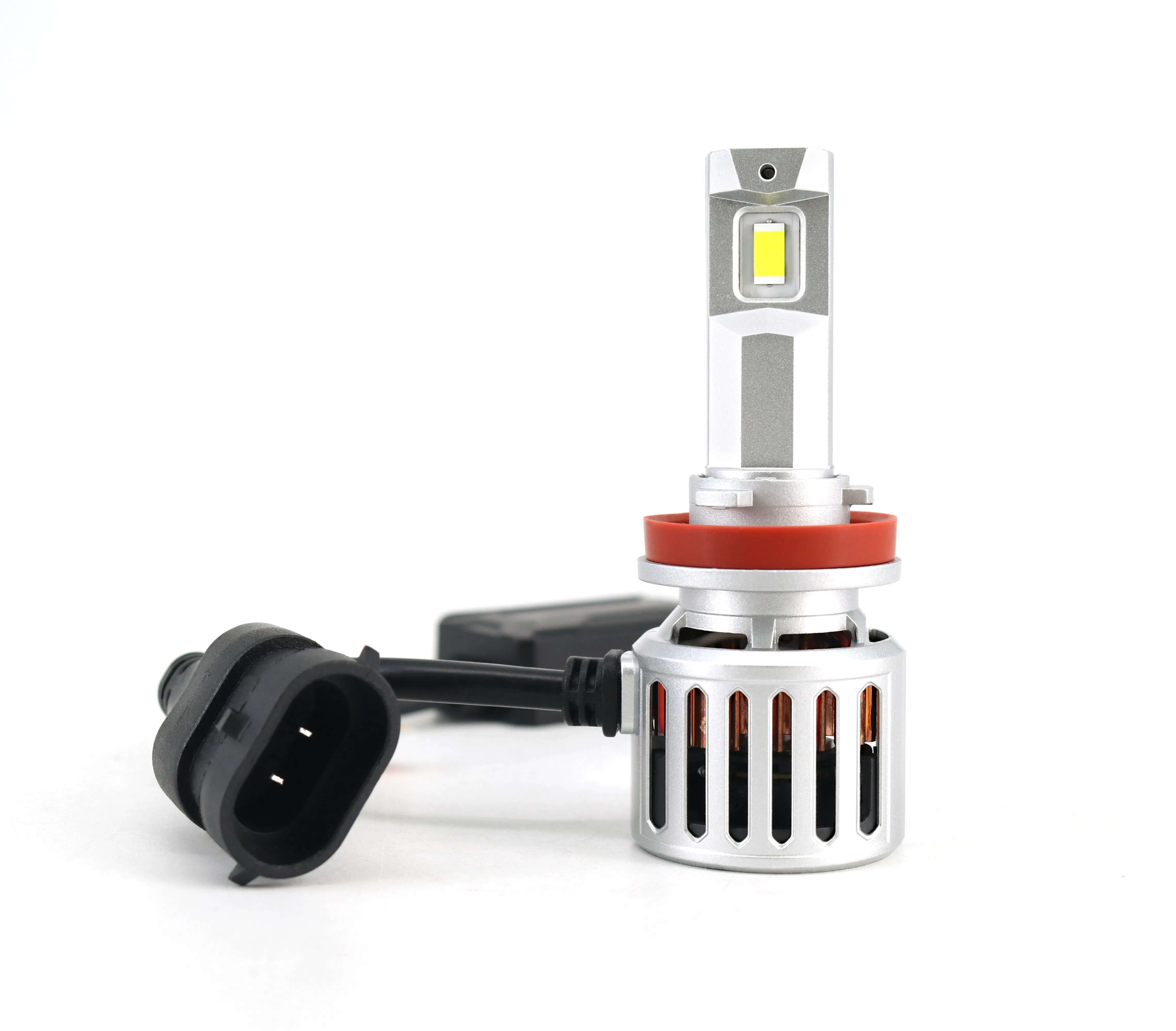
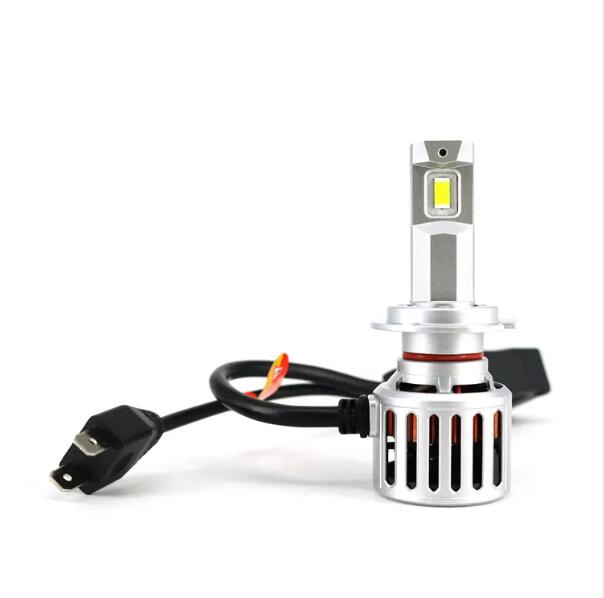
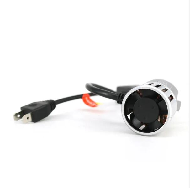
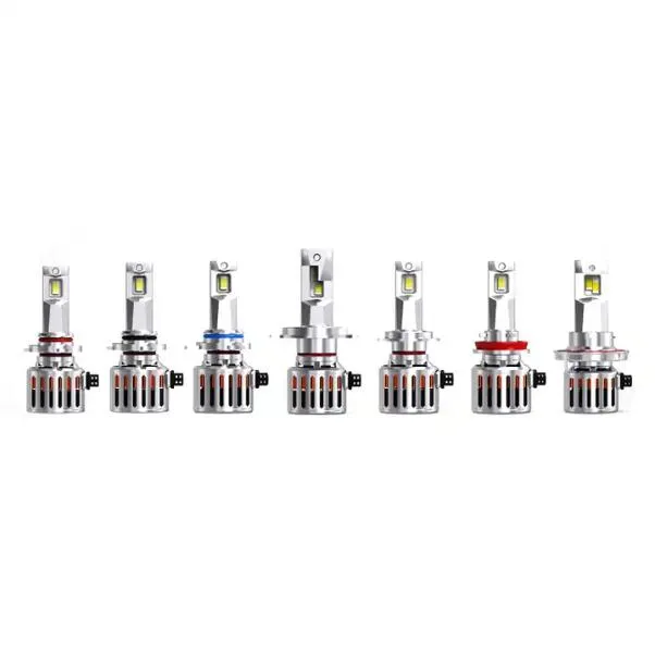
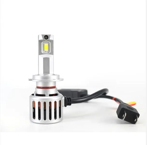
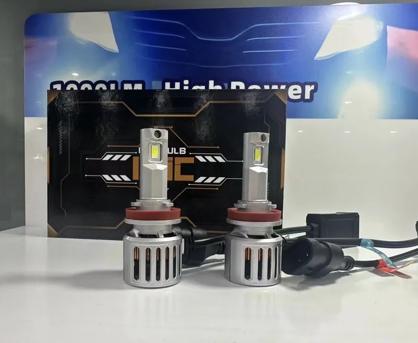
| Model Number | H7 |
|---|---|
| Car Model | Universal cars |
| Product Name | F9C LED Headlight |
| Wattage | 90W - Power packed to illuminate every drive with precision. |
| Lumen | 14000LM - Exceptional brightness for a crystal-clear view. |
| Lamp Type | GC-7545 - Modern design for superior performance. |
| Color Temperature | 6500K Nature White |
| Function | Car Driving Light |
| Material | Aviation Aluminum |
| Waterproof Rate | IP 65 |
| Beam | High Low Beam |
| Lifespan | 50000 Hours |


display: grid;
grid-template-columns: repeat(4, 1fr);
gap: 15px;
For input.
Thanks.
Hi
Your setup will align things automatically as long as the inputs occupy only 1 flex/grid column, like this:
If the widths differ due to the length of the labels you want to use, you can set the label to display: flex and use a min-width on the actual text to force alignments:
Wait, can you share the config fields setup visually. I have created a group custom fields, inside has many textboxes.
1. Group (Name: Contact)
1.1 Text field: Name
1.2 Text field: Phone
1.3. Text field: Skype
Is this structure same as yours? I applied the code to my group and look like this. I wanted to control the column width like (eg: grid-column: span 1/4) so I can control input text field area.
Yes, that is structured.
Here is standard grid configuration that should do it:
Parent element of fields (the containing element):
display: grid;
grid-template-columns: repeat(2, 1fr); /* creates 2 equal columns */
gap: 16px; /* spacing between columns and rows */
Each field element (to allow the text field to match the size you want):
display: grid;
grid-template-columns: 100px 1fr; /* 100px for label, remaining for input */
align-items: center; /* vertical alignment */
gap: 8px; /* space between label and input */
Since you mentioned "so I can control input text field area":
If you want a field to span the full width (both columns):
grid-column: span 2;
If you want one column wide and one column narrow (e.g. 1fr and 2fr):
Change the parent grid-template-columns to:
grid-template-columns: 1fr 2fr;
Let me know if you need specific styling variables targetting your exact HTML structure.
Thanks.
I have wrapped these inputs using "Container CSS classes" that contains following configuration under container/layout settings section inside. I set layout to horizontal.
display: grid;
grid-template-columns: repeat(2, 1fr);
gap: 10px;
How will I apply this? Where to add?
Each field element (to allow the text field to match the size you want):If you are using the container settings (Layout -> custom CSS class) to apply `display: grid`, the HTML structure generates wrapped divs for each custom field. To target the inner fields and align labels, you can add this to your theme's custom CSS file or the custom CSS area in the admin panel:
/* Target the individual field containers inside your grid */
.your-custom-container-class > div {
    display: grid !important;
    grid-template-columns: 120px 1fr; /* Adjust 120px to fit your longest label */
    align-items: center;
    gap: 10px;
}

/* Ensure the label itself behaves properly */
.your-custom-container-class label {
    margin-bottom: 0 !important; /* Remove default bottom margin if any */
}
Replace `.your-custom-container-class` with the actual class name you entered in the "Container CSS classes" field.
Thanks.
Let me test this. I added class to group "Custom CSS class" but in inspect I don't see it applied to it. In my inspect I see the div class field text.
Is it possible to reference ".field.text" directly or how to get the custom css class to be applied inside group container?
Thanks.
Yes, you can target it directly, but without a parent wrapper class it might affect all text inputs on your site.
If you want to apply it only to a specific group, the custom class should be on the wrapper. In osClass, if you add a class to a custom field group, it usually applies to the fieldset or a container div.
If it's not applying, check if you have a class called `.meta_list` or similar wrappers.
To target the text fields globally within that section:
.meta_list .field.text {
    display: grid !important;
    grid-template-columns: 120px 1fr;
    align-items: center;
    gap: 10px;
}
Check your page source/inspect tool to see what parent class wraps all those custom fields.
Thanks.
I noticed that "Container CSS class" under Custom Field Group setting doesn't output. It only works on single fields. It makes sense because they are group under one div container class named "meta_list".
Wait, is there any way to apply "Container CSS class" directly into the Group? I added custom class inside group and single fields as well. I don't see it outputting class.
Thanks for the code. This is very close.
It has shifted the labels as intended.
But now they are all vertical. How can I make them horizontal like.
Label 1 - Input 1 | Label 2 - Input 2
Label 3 - Input 3 | Label 4 - Input 4
Thanks,
To get them in a 2-column layout horizontally (Label 1 - Input 1 | Label 2 - Input 2), you need to apply grid to the parent container (`.meta_list`) as well.
Add this:
/* The parent container holding all fields */
.meta_list {
    display: grid !important;
    grid-template-columns: repeat(2, 1fr) !important; /* 2 equal columns */
    gap: 20px !important; /* spacing between fields */
}

/* The individual field containers */
.meta_list .field {
    display: grid !important;
    grid-template-columns: 120px 1fr !important; /* 120px label, remaining space for input */
    align-items: center !important;
    margin: 0 !important; /* remove default margins to avoid alignment issues */
}

/* Clean up label margins */
.meta_list .field label {
    margin: 0 !important;
}
This will align them side-by-side in 2 columns, with each field having a perfectly aligned label and input.
Thanks.
This layout is perfect. I adjusted it to 3 columns and applied some spacing.
Is there a way to target specific text fields inside `meta_list` to span across two or three columns?
For example, I want "Description" (which is a textarea) to span across all 3 columns.
Thanks.
Yes, you can target specific fields by their IDs or by using the `nth-child` selector.
Since they are generated dynamically, they usually have unique IDs or names, but you can also use `[data-name]` or the standard class with `:nth-child()`.
To make a specific field span all 3 columns:
/* Target by ID if it has one (recommended) */
#meta_description-field-id {
    grid-column: span 3 !important;
}

/* Or target by the field type if it's the only textarea */
.meta_list .field:has(textarea) {
    grid-column: span 3 !important;
}
If you need to adjust the layout inside that spanned field (e.g. keeping the label on top instead of the side for a large textarea), you can do:
.meta_list .field:has(textarea) {
    grid-column: span 3 !important;
    display: flex !important;
    flex-direction: column !important;
    align-items: flex-start !important;
}
Thanks.
Wow, that worked nicely. The class name was `meta_25` (text area ID). So I applied `grid-column: span 3 !important;`. The alignment is clean.
I'm happy with this outcome. Thank you.
You're very welcome! Glad we got the alignment looking sharp and organized.
Let me know if you need anything else!